SAS Hagmann — Medtech brand identity
A full rebrand for a German analytical-chemistry company moving into medical technology — beaker mark, Suisse type and an orange-and-graphite system.
Context
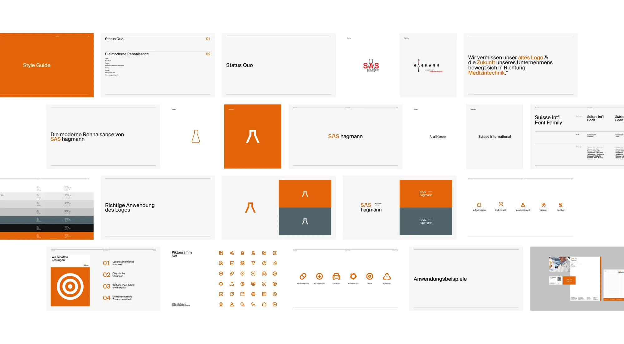
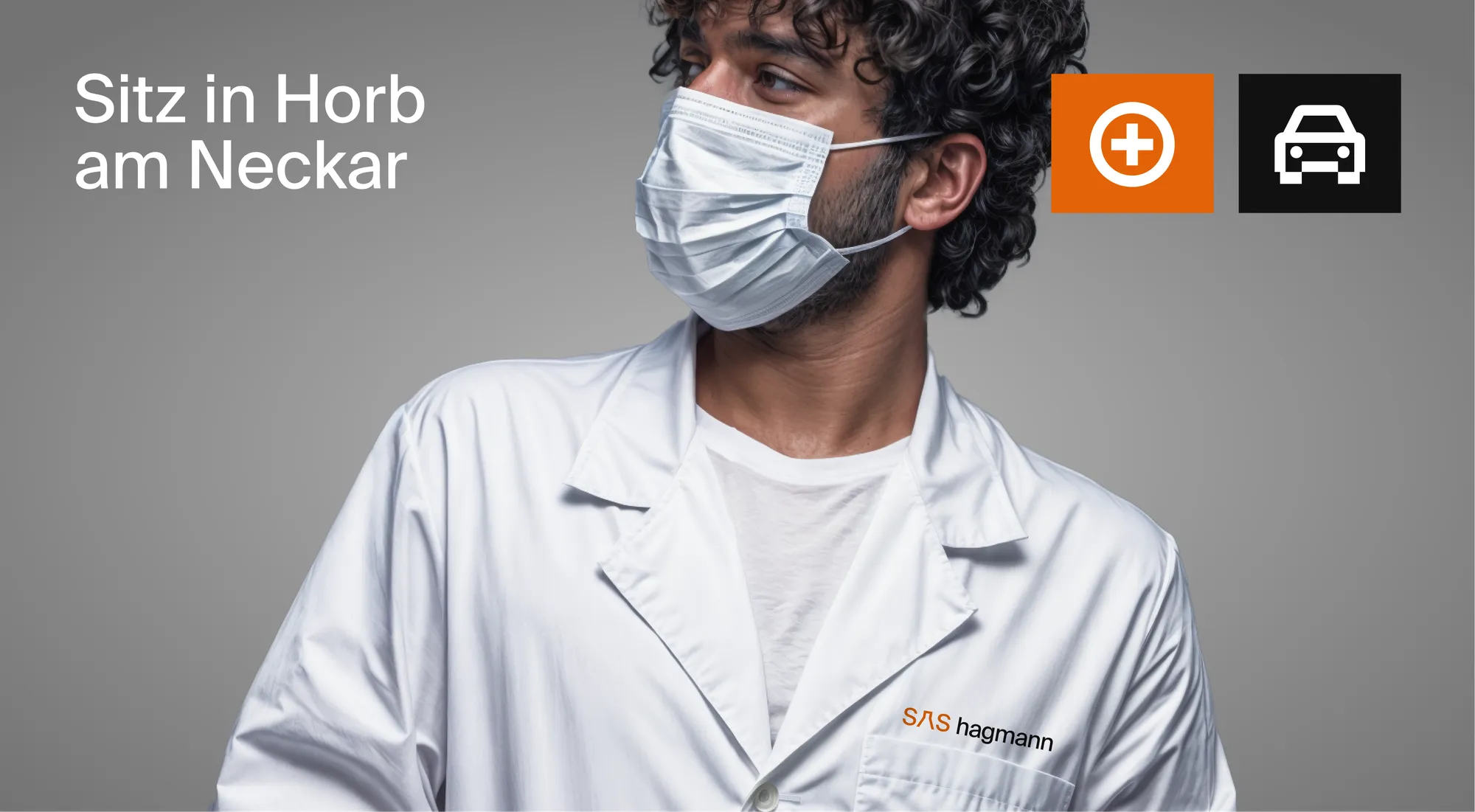
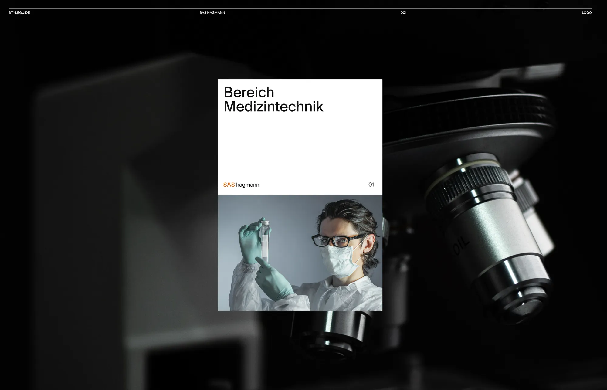
SAS Hagmann (SAS Hagmann GmbH & Co. KG) is a German company in Horb am Neckar — a sworn expert for analytical chemistry now expanding into medical technology. The project was a full rebrand: 'the modern renaissance of SAS Hagmann.'
Problem
The old logo no longer matched where the company was heading. The brand had to signal precision, trust and a move toward Medizintechnik — while staying credible to its pharma, automotive and engineering clients.
Role
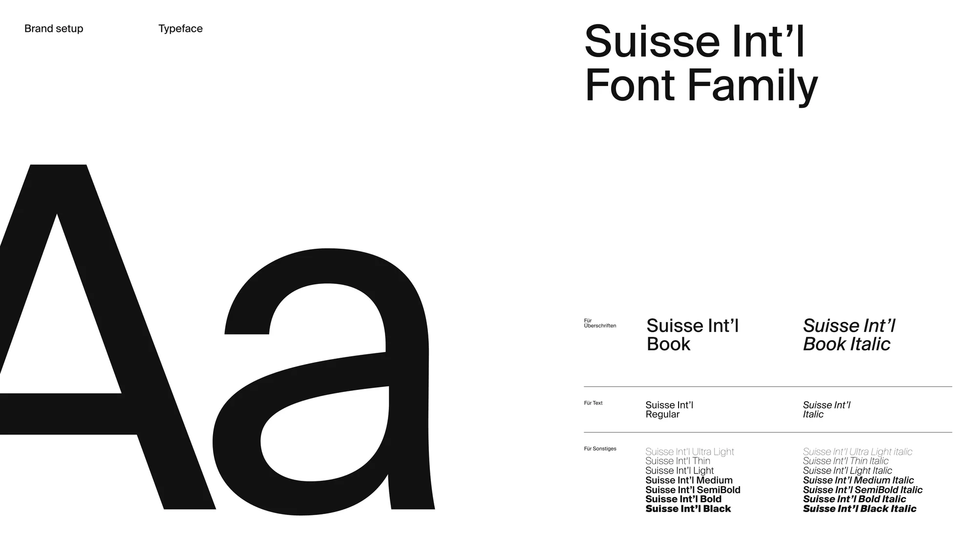
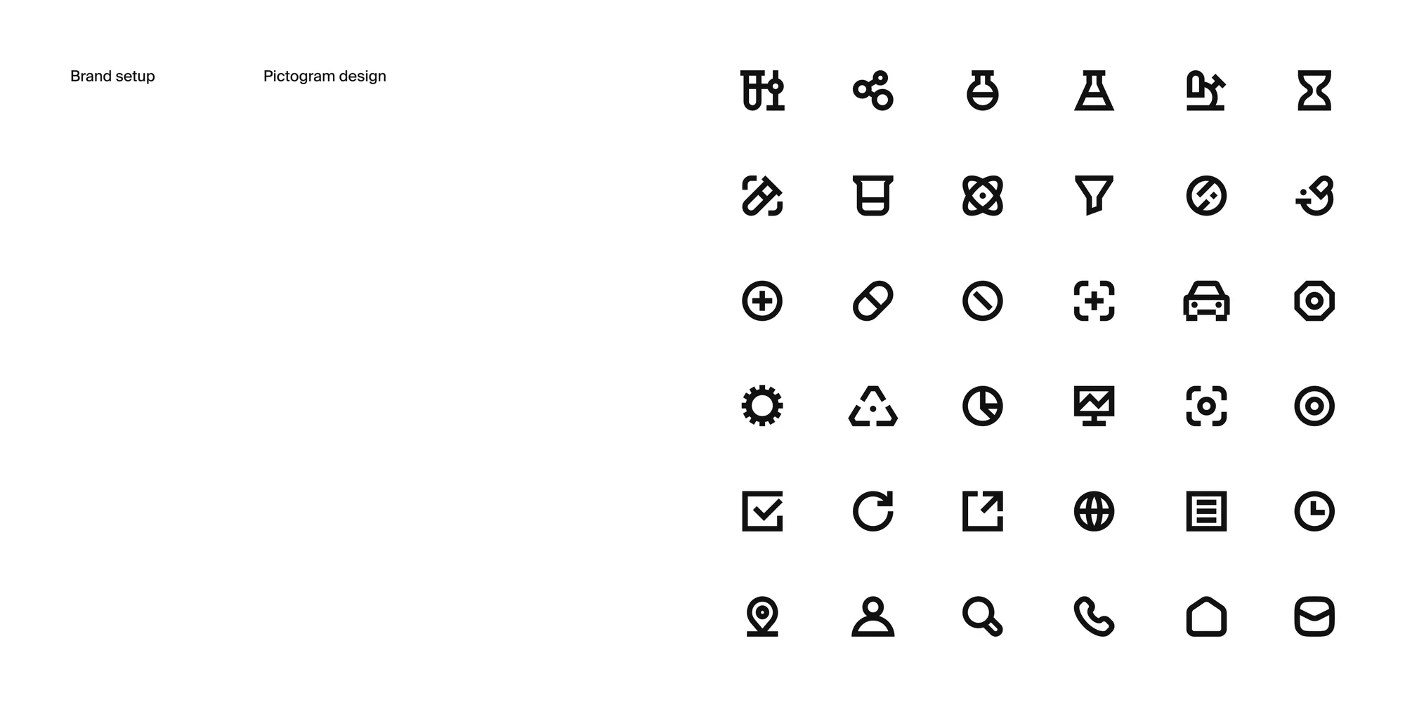
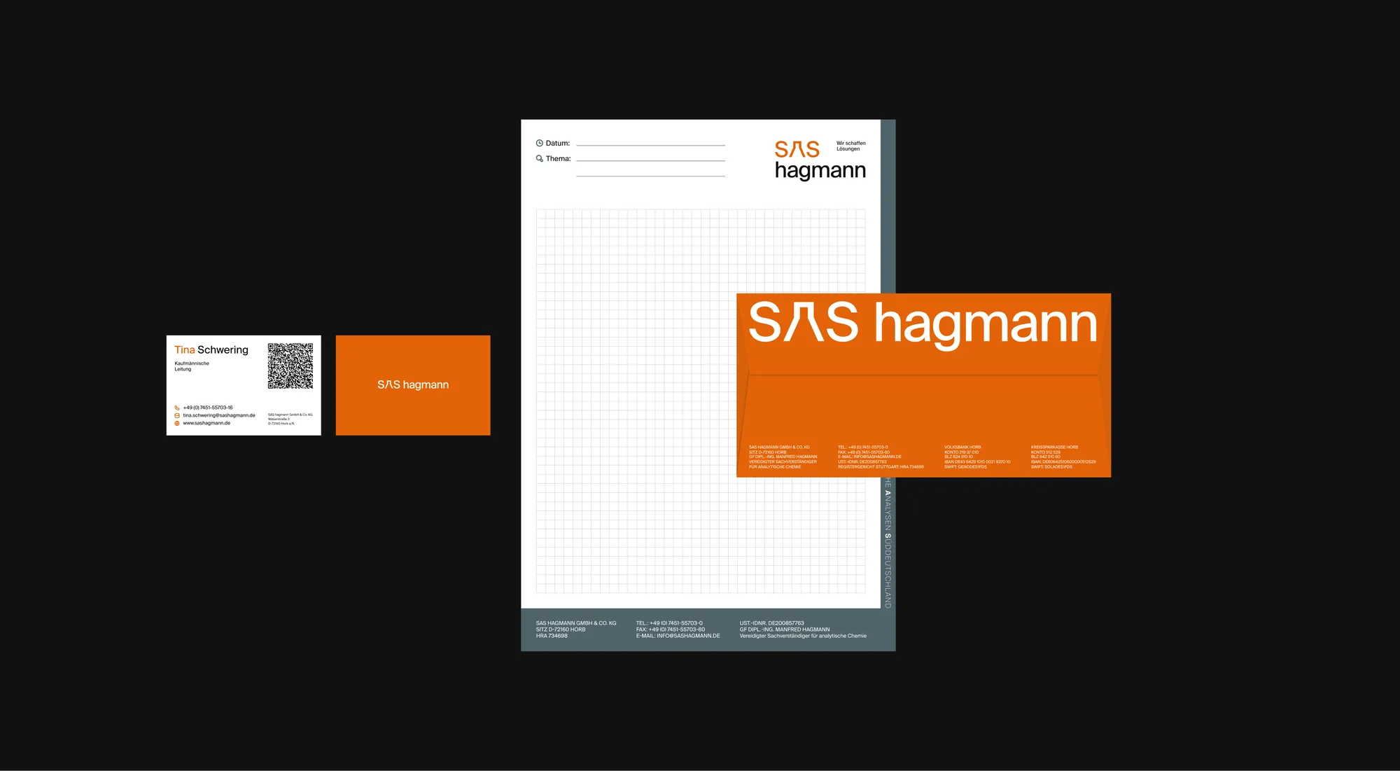
Brand identity end-to-end — the beaker logo, the Suisse Int'l type system, the orange-and-graphite palette, a full pictogram set, sector iconography, social templates and stationery.
Solution
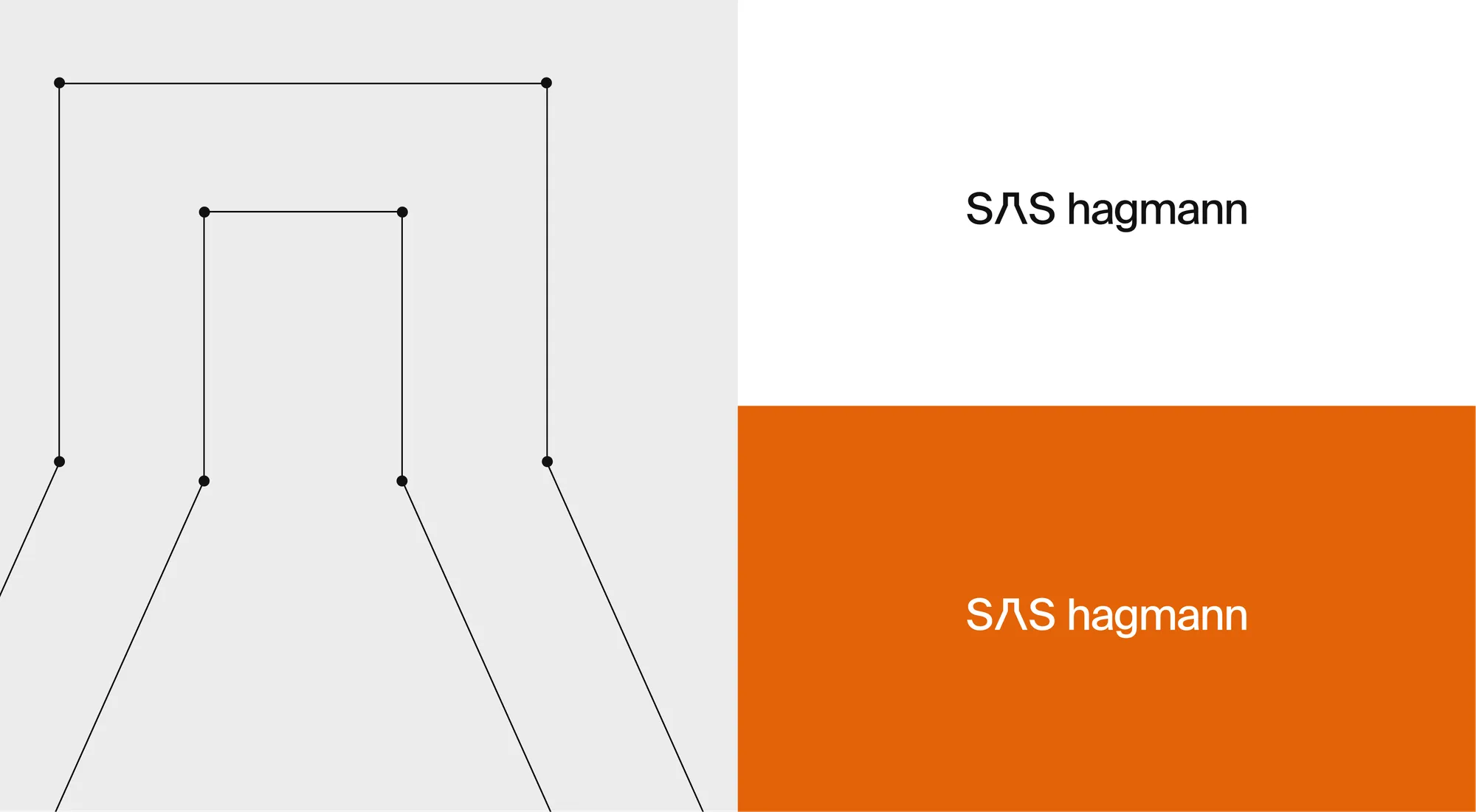
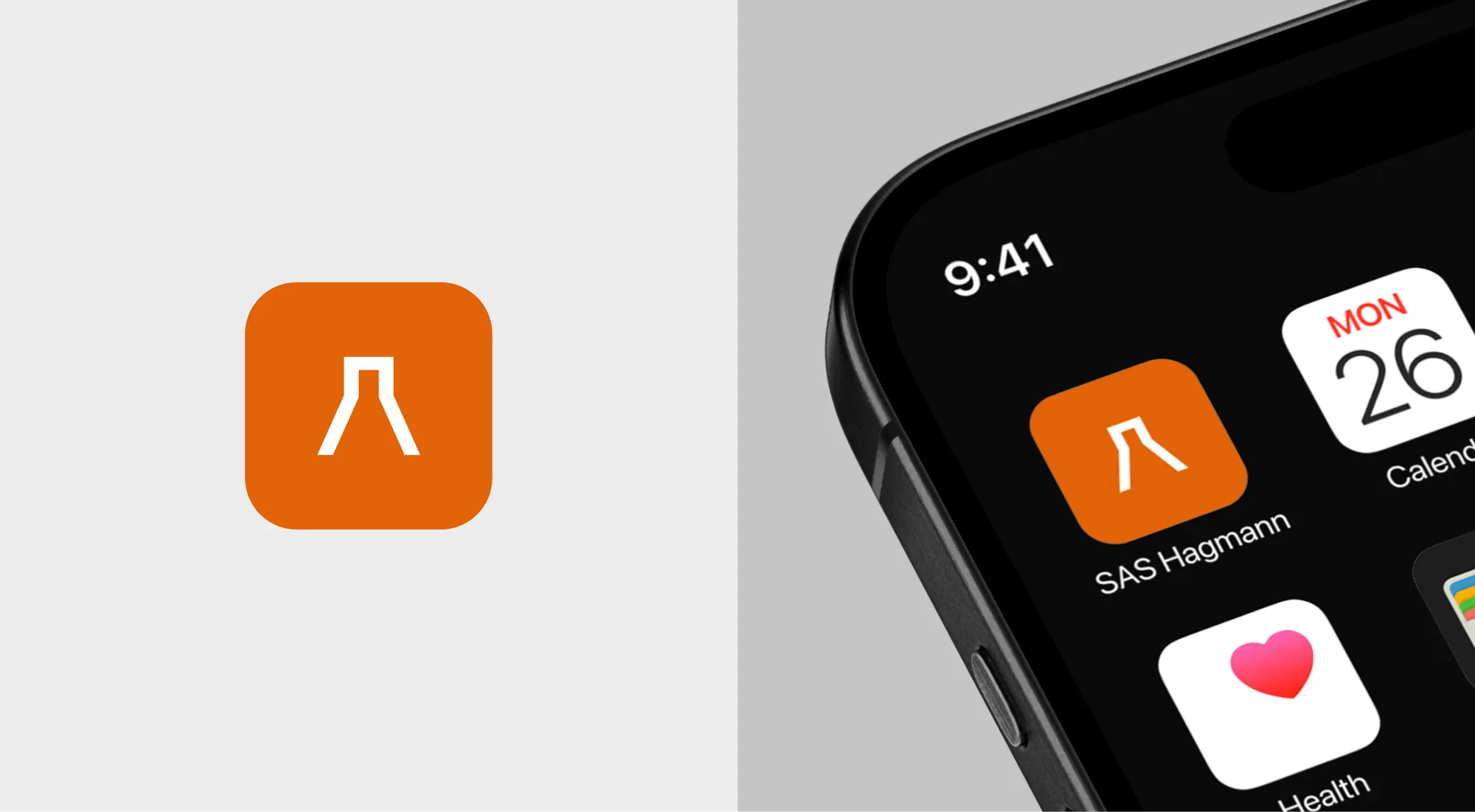
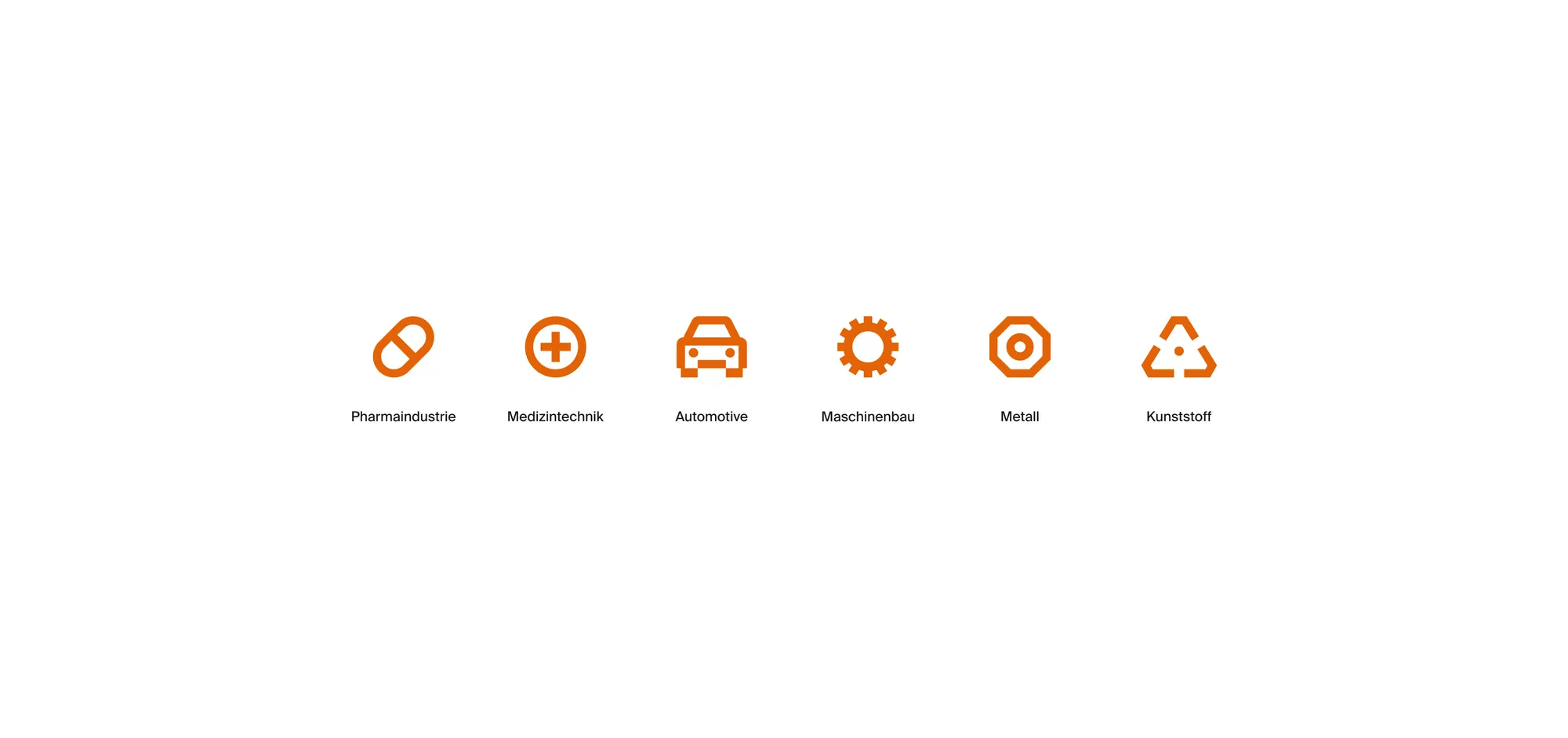
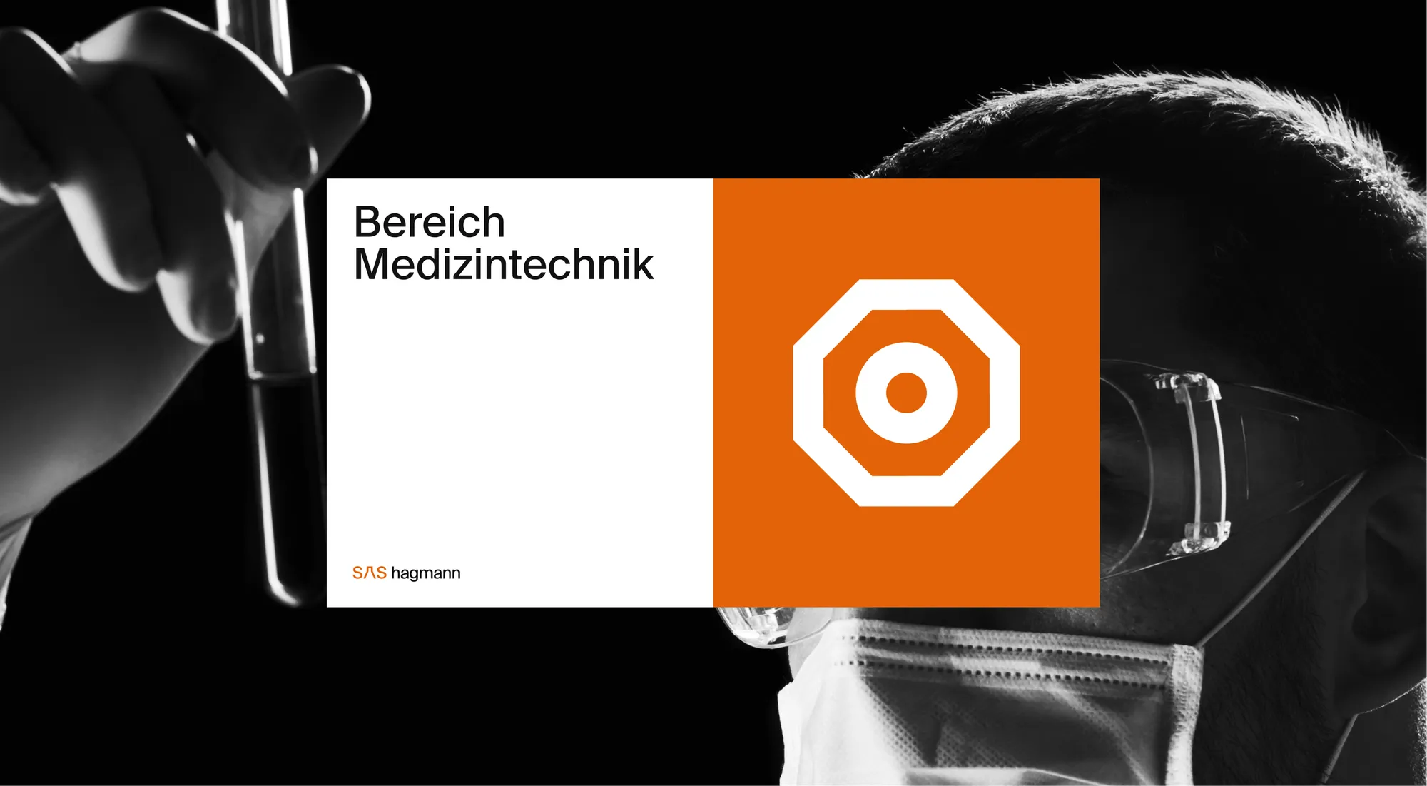
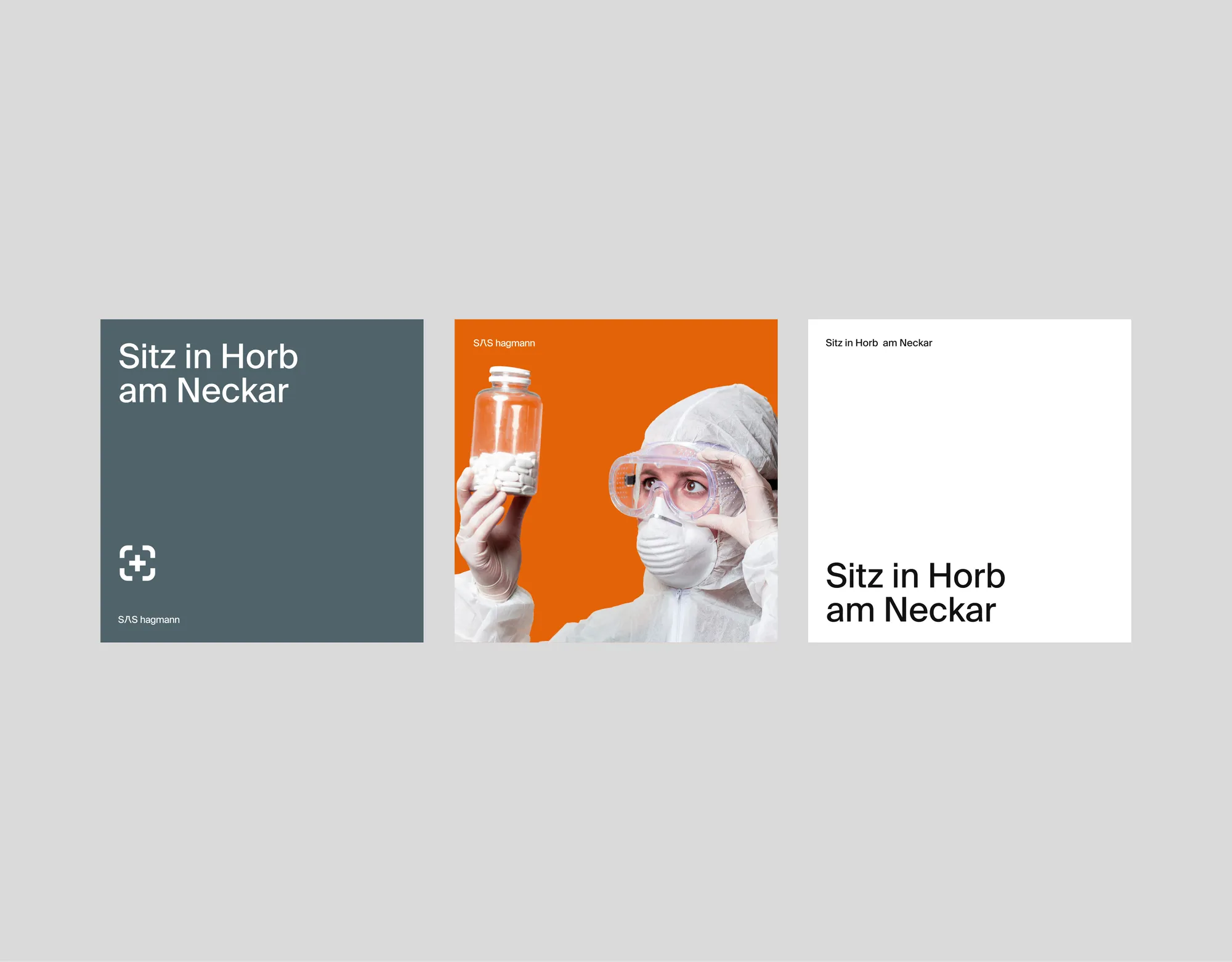
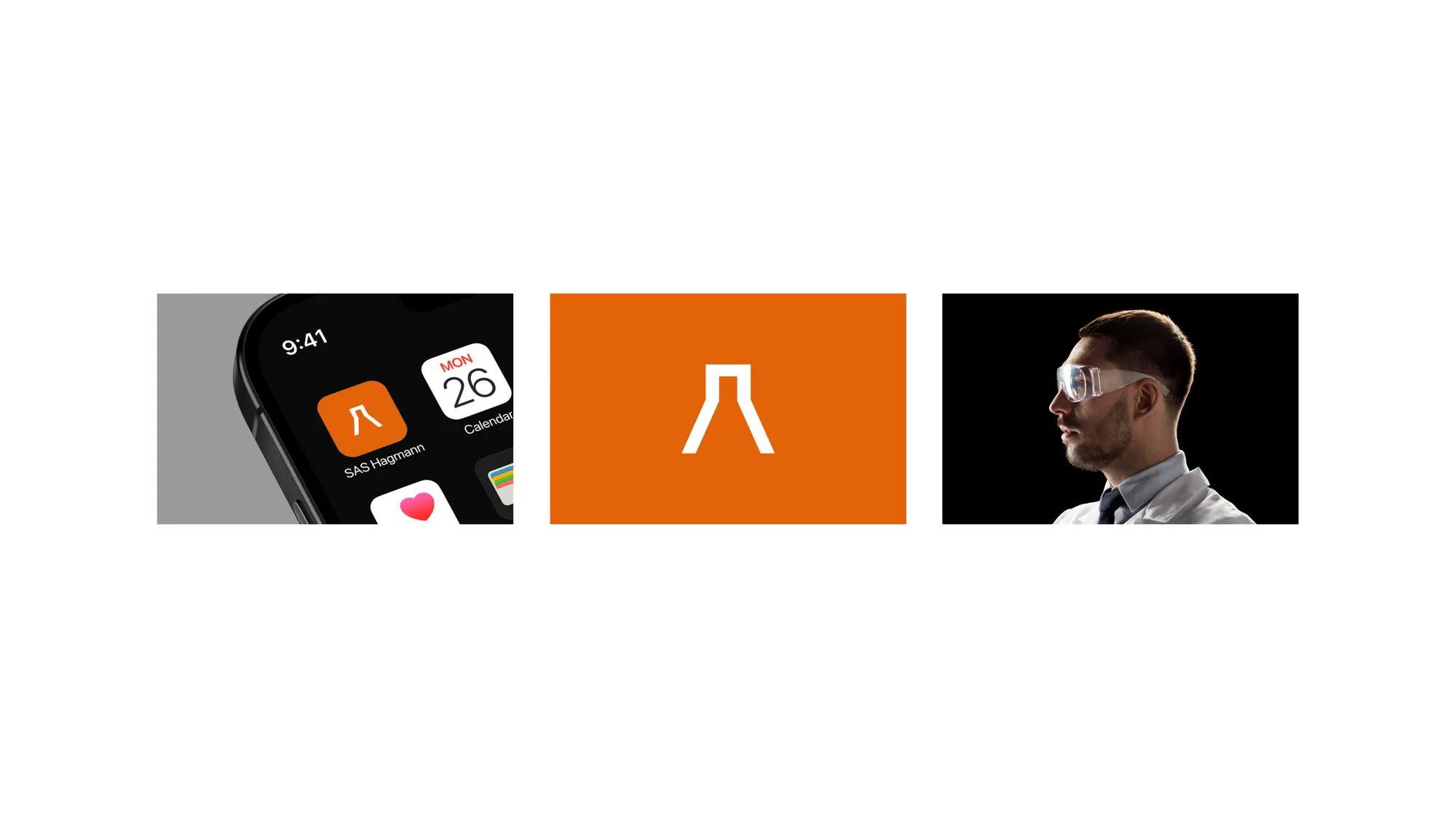
A precise, Swiss-style system: a beaker mark drawn on a clean grid, Suisse Int'l typography and a confident orange-and-graphite palette, with a pictogram language spanning the company's sectors — pharma, medtech, automotive, engineering, metal and plastics — applied across app icon, print and social.
Impact
A cohesive, precise brand that repositions SAS Hagmann from a chemical-analysis lab toward a modern medical-technology company.